Modern CSS in 2026: Container Queries, :has(), and Cascade Layers
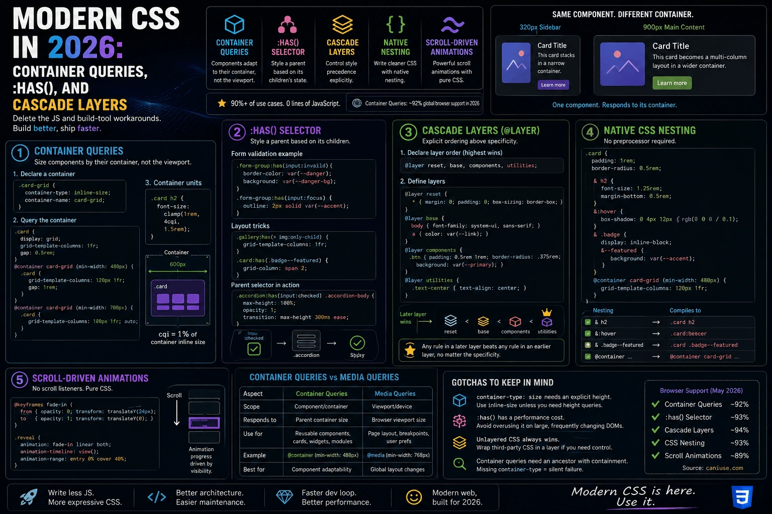
I spent a chunk of last week ripping JavaScript out of a component library. Not because it was buggy — because it didn’t need to exist anymore. A resize observer that toggled a class based on container width, a form validation script that just added an “invalid” class to a parent div, a PostCSS plugin that faked layer-like ordering — all three jobs are now native CSS. This post is a walkthrough of the three features that made that possible: container queries, :has(), and cascade layers, plus native nesting and scroll-driven animations along the way, with real code for each.
Why modern CSS replaced so much JavaScript in 2026
For years, CSS could only react to the viewport. If you wanted a card to look different depending on the width of the column it sat in — not the browser window — you needed JavaScript: a ResizeObserver watching the container, a class toggled in response, and now your “CSS” component actually depends on a script tag to render correctly. Same story for anything that needed to style a parent based on a child’s state, or for controlling which of two conflicting style rules should win without playing specificity Jenga with !important.
Container queries, :has(), and cascade layers close those three gaps directly in the stylesheet. None of them are brand new as of this year, but 2026 is the point where all three have wide enough browser support — container queries alone are sitting around 92% global support — that reaching for a JS workaround instead is now the exception, not the default. Combined with native CSS nesting and scroll-driven animations, you can build genuinely responsive, stateful, well-ordered component systems in plain CSS, and delete a fair amount of glue code doing it.

CSS container queries tutorial: sizing components by their container, not the viewport
A media query asks “how wide is the browser window?” A container query asks “how wide is the box this component is actually sitting in?” That distinction sounds small until you build something like a card component that gets dropped into a wide main column in one layout and a narrow sidebar in another. With media queries, that card can’t tell the difference — the viewport is the same in both cases. With container queries, it can.
Setting up a containment context
Before you can query a container’s size, you have to declare that element as a container:
.card-grid {
  container-type: inline-size;
  container-name: card-grid;
}
container-type: inline-sizetells the browser to track the element’s width (the common case for responsive components).sizetracks both width and height, but requires the element to have a defined height, which is rarer in practice.container-nameis optional but worth adding once you have more than one container type in a stylesheet — it lets you target a specific ancestor instead of just “the nearest container.”
Querying it
.card {
  display: grid;
  grid-template-columns: 1fr;
  gap: 0.5rem;
}

@container card-grid (min-width: 480px) {
  .card {
    grid-template-columns: 120px 1fr;
    gap: 1rem;
  }
}

@container card-grid (min-width: 700px) {
  .card {
    grid-template-columns: 160px 1fr auto;
  }
}
Drop .card into a 320px-wide sidebar and it stacks vertically. Drop the exact same markup and the exact same CSS into a 900px-wide main content area, and it lays out as a three-column row — no JavaScript, no duplicate component variant, no ResizeObserver anywhere in sight. This is the single biggest win container queries give you: one component definition that adapts to wherever it’s placed, instead of a family of “Card” and “CardCompact” and “CardWide” components maintained in parallel.
Container query units
Alongside @container rules, you also get container-relative units — cqw, cqh, cqi, cqb — which behave like vw/vh but scale against the container instead of the viewport:
.card h2 {
  font-size: clamp(1rem, 4cqi, 1.5rem);
}
That heading scales smoothly with the card’s own width, not the page’s, so it stays proportionate whether the card is 200px or 800px wide.
The :has() selector: styling a parent based on its children
This is the one that used to be flatly impossible in CSS. Selectors have always worked downward — style a child based on its parent or an ancestor’s class — never upward. If you wanted a form group to turn red when the input inside it was invalid, or a card to get a highlighted border when it contained an unread badge, you needed JavaScript to inspect the child and toggle a class on the parent.
:has() is a relational pseudo-class that lets a selector match an element if it contains (or is followed by, depending on the combinator) something matching the argument.
/* Style a form group based on its input's validity state */
.form-group:has(input:invalid) {
  border-color: var(--color-danger);
  background: var(--color-danger-bg);
}

.form-group:has(input:focus) {
  outline: 2px solid var(--color-accent);
}
No JavaScript event listener, no class toggling — the browser already tracks :invalid and :focus on the input, and :has() lets the parent react to that state directly.
A layout trick: styling a grid based on its item count
:has() combined with :nth-child unlocks layout decisions that used to require a script counting DOM children:
/* If a gallery has exactly one image, make it full width */
.gallery:has(> img:only-child) {
  grid-template-columns: 1fr;
}

/* If a card contains a "featured" badge, bump its grid span */
.card:has(.badge--featured) {
  grid-column: span 2;
}
Using :has() as a real parent selector
The pattern that got me the most excited: styling a sibling based on a checkbox or radio state, without the old “checkbox hack” that relied on strict sibling ordering in the markup:
.accordion:has(input[type="checkbox"]:checked) .accordion-body {
  max-height: 100%;
  opacity: 1;
}
:has() reads naturally where the old adjacent-sibling checkbox hack read like a puzzle. That readability difference matters more than it sounds — code that’s easy to read is code the next person (often future-you) won’t break by accident.

Cascade layers (@layer): explicit ordering above specificity
Specificity wars are the single most common source of !important littered through a real-world stylesheet. Two rules target the same element, one has a more specific selector, and it wins — regardless of which one you actually wanted to take priority. Cascade layers fix this by adding an ordering mechanism that sits above specificity entirely.
The rule is simple once it clicks: any rule in a later-declared layer beats any rule in an earlier layer, no matter how specific the earlier rule’s selector is. Specificity only gets used to resolve conflicts within the same layer.
Declaring layer order up front
@layer reset, base, components, utilities;
That single line declares the order before any of the layers have content — reset loses to base, base loses to components, components loses to utilities. You can then fill each layer in any order, in any file, and the declared order still wins:
@layer reset {
  * { margin: 0; padding: 0; box-sizing: border-box; }
}

@layer base {
  body { font-family: system-ui, sans-serif; line-height: 1.5; }
  a { color: var(--color-link); }
}

@layer components {
  .btn {
    padding: 0.5rem 1rem;
    border-radius: 0.375rem;
    background: var(--color-primary);
  }
}

@layer utilities {
  .text-center { text-align: center !important; }
}
Here’s the payoff: even though .btn in components is more specific than a bare a selector in base, layer order — not specificity — decides the outcome whenever they conflict. And a low-specificity utility class like .text-center in the utilities layer still beats a highly specific component selector in components, because utilities was declared last. That’s the exact job utility-first CSS frameworks used to need a build step and careful source-order discipline to fake — @layer gives it to you natively.
Third-party CSS gets its own layer automatically
Anything not wrapped in a named @layer block is treated as the highest-priority unlayered layer — it beats every named layer regardless of order. That’s a deliberate design choice: it means your own layered architecture always loses to un-layered overrides by default, which is usually what you want for a quick one-off fix, but it also means third-party CSS you do want to layer needs to be wrapped explicitly:
@layer vendor, reset, base, components, utilities;

@import url("some-vendor-library.css") layer(vendor);
Now vendor styles sit at the bottom of your explicit order, instead of silently out-ranking everything else on the page.
Native CSS nesting: no preprocessor required
For a decade, nesting selectors meant reaching for Sass or Less. Native CSS nesting removes that dependency for the common cases:
.card {
  padding: 1rem;
  border-radius: 0.5rem;

  & h2 {
    font-size: 1.25rem;
    margin-bottom: 0.5rem;
  }

  &:hover {
    box-shadow: 0 4px 12px rgb(0 0 0 / 0.1);
  }

  & .badge {
    display: inline-block;

    &--featured {
      background: var(--color-accent);
    }
  }
}
The & works the way it does in Sass — it’s a placeholder for the parent selector, so &:hover compiles conceptually to .card:hover and &--featured inside .badge becomes .badge--featured. Combined with container queries, you can nest a @container rule directly inside a component’s own block instead of writing it as a separate, disconnected rule elsewhere in the file:
.card {
  display: grid;
  grid-template-columns: 1fr;

  @container card-grid (min-width: 480px) {
    grid-template-columns: 120px 1fr;
  }
}
That keeps every rule affecting .card physically in one place, which is a real maintainability win once a stylesheet grows past a few hundred lines.
Scroll-driven animations: no more scroll event listeners
The other JS workaround that’s quietly disappeared: animating something in response to scroll position — a progress bar, a parallax effect, a fade-in as an element enters the viewport — used to mean a scroll event listener, requestAnimationFrame throttling, and manual math to compute a percentage. animation-timeline does the same job natively:
@keyframes fade-in {
  from { opacity: 0; transform: translateY(24px); }
  to   { opacity: 1; transform: translateY(0); }
}

.reveal {
  animation: fade-in linear both;
  animation-timeline: view();
  animation-range: entry 0% cover 40%;
}
animation-timeline: view() ties the animation’s progress to the element’s position as it scrolls through the viewport, instead of to elapsed time. No listener, no manual IntersectionObserver wiring, no jank from a scroll handler running on the main thread — the browser’s compositor drives it directly.
Container queries vs media queries: when to use each
A question I get a lot, so worth answering directly:
- Use a media query when the thing you care about is genuinely tied to the viewport or device — page-level layout shifts, print styles,
prefers-color-scheme,prefers-reduced-motion. - Use a container query when the thing you care about is a component that might be reused at different widths across a layout — cards, sidebars widgets, nav items, form groups. If the component doesn’t know or care where it’s rendered, container queries are almost always the better fit.
They’re not competitors — a real component library ends up using both, media queries for the page shell and container queries for everything that lives inside it.
Common gotchas with container queries, :has(), and @layer
A few things that tripped me up moving old code over:
container-type: sizeneeds an explicit height. If the container has no defined height (the common case for a block that just grows with its content),sizecontainment collapses it to zero height. Useinline-sizeunless you specifically need to query height too, and you’ve given the element a real height.:has()has a performance cost. Because it can match based on descendant state, the browser has to re-evaluate it more aggressively than a simple selector. It’s fine for the moderate DOM sizes most real pages have, but avoid:has()inside a selector that runs against thousands of nodes on every keystroke.- Unlayered CSS always wins. If a component suddenly stops respecting your
@layerorder after adding a third-party stylesheet or inline<style>block, check whether that CSS is wrapped in a layer — unlayered rules beat every named layer by default, which surprises people the first time they hit it. - Container queries need an ancestor with containment, not just any wrapper. If
@containerrules seem to be silently ignored, check that some ancestor actually hascontainer-typeset — a missing containment context fails silently rather than throwing an error.
FAQ
What browser support do CSS container queries have in 2026? Around 92% global support as of this year across evergreen browsers, which puts them solidly in “safe to use as a primary layout tool” territory for most production sites, with a graceful fallback to your existing layout for the small remaining slice of older browsers.
Can :has() replace JavaScript for form validation styling?
For purely visual, state-driven cases — yes. .form-group:has(input:invalid) reacts to the browser’s own validity state without any script. You’ll still want JavaScript for anything involving custom validation logic beyond what HTML’s built-in constraint validation covers, or for submitting/blocking the form itself.
Do cascade layers replace the need for !important?
Mostly. @layer order settles the vast majority of conflicts that used to get “solved” with !important stacked on top of increasingly specific selectors. !important still exists and still has its place (a genuine emergency override), but a well-structured layer order should make it rare rather than routine.
Can I use container queries and media queries together? Yes, and you usually should — media queries for page-level, viewport-driven layout; container queries for components that need to adapt to wherever they’re placed. They compose without conflict.
Closing thought
None of these four features are flashy on their own — a query, a selector, an at-rule, a syntax shortcut. What’s changed is that together they cover enough ground that CSS stopped being “the styling layer you sprinkle JS workarounds around” and started being an actual architecture tool you can reason about on its own terms: components that adapt to their container, styles that react to state without a script, and an explicit, readable ordering system instead of a specificity guessing game. I didn’t set out to delete a ResizeObserver, a validation script, and a PostCSS plugin in the same week — it just turned out none of them were pulling their weight anymore.